What Is Responsive Website Design? (Definition, Examples & How EZPages.Pro Helps)
A responsive website is no longer optional. It's how your business earns trust, ranks in search results, and converts visitors into customers-regardless of whether they're on a phone, tablet, or widescreen monitor. This guide breaks down exactly what responsive web design is, how it works under the hood, common pitfalls to avoid, and how EZPages.Pro can get you a fast, mobile-first site without the headache.
Key Takeaways
- Responsive web design is a single-site approach where layout, navigation, and content automatically adjust to any screen size using a flexible grid layout, responsive images, and CSS media queries. Instead of merely shrinking a desktop page, a responsive site reorganizes content to fit the user's device and browser width.
- Over 60% of global web traffic now comes from mobile devices. A non-responsive site directly hurts your conversions, search engine rankings, and user trust. Google uses mobile-first indexing, meaning the mobile version of your site is what gets crawled and ranked.
- Responsive design differs from "mobile-friendly" by actively reflowing content-adjusting columns, typography, navigation patterns, and interactive elements-rather than just scaling everything down. This produces a seamless user experience across different devices.
- EZPages.Pro builds mobile-first, fully responsive websites for small businesses and startups worldwide, typically launched within 2–4 weeks. Everything from design and hosting to SEO and compliance is handled under one roof.
- The rest of this article covers core concepts (flexible grid, responsive images, media queries), real-world responsive web design examples across ecommerce, blogs, and SaaS, common mistakes, and how EZPages.Pro can implement all of this for your business.

What Is Responsive Web Design?
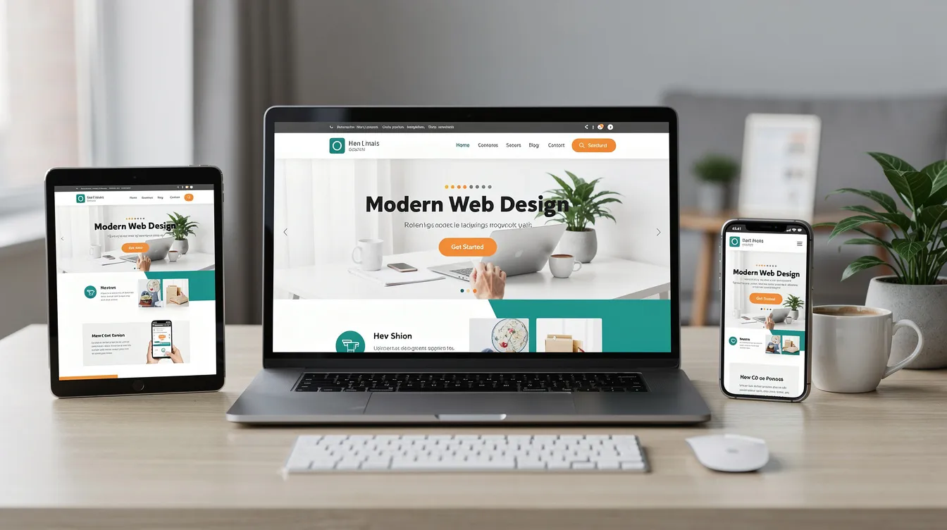
Responsive web design is an approach to website design where a single web page automatically adjusts its layout, content blocks, and navigation based on screen size, orientation, and browser width. Rather than building separate versions for phones, tablets, and desktops, one set of HTML adapts fluidly to the user's device.
The term was coined by Ethan Marcotte in 2010 in his influential article for A List Apart. Before that, many businesses ran separate "m.yoursite.com" mobile sites-duplicating content, splitting SEO value, and doubling maintenance. Responsive web design adapts layouts based on screen size, replacing that fragmented approach with a unified solution.
At its core, responsive design relies on three technical pillars: flexible grid layouts that use relative units instead of fixed pixel widths, flexible images that scale within their containers, and media queries that apply specific CSS rules at defined breakpoints. Together, these let web pages render cleanly whether the browser window is 375 pixels wide or 2560 pixels wide.
It's important to distinguish "mobile-friendly" from "mobile responsive." A mobile friendly design might simply scale a desktop layout down so it technically fits on a phone screen-but text may be too small, buttons too tiny, and horizontal scrolling inevitable. A mobile responsive website actually reflows its layout: columns stack, navigation transforms, font size increases, and images resize. The difference is the gap between "it works" and "it works well."
Why Responsive Website Design Matters in 2026
As of 2026, mobile devices account for roughly 62–64% of all global web traffic. Mobile users expect fast, readable, tap-friendly web pages. If your site forces them to pinch-zoom, scroll sideways, or wait for oversized images to load, they leave.
A responsive layout directly improves user experience: text stays readable across all devices, navigation remains accessible, and interactive elements are appropriately sized for touch. Responsive websites reduce bounce rates and improve engagement-data shows responsive sites tend to have approximately 11–12% lower bounce rates and nearly 10% higher conversion rates. Effective responsive design also improves website loading times by optimizing content for mobile, which users on slower networks notice immediately.
Google's mobile-first indexing means the search engine uses the mobile version of your site as its primary basis for crawling and ranking. A weak mobile experience drags down rankings even if the desktop version looks polished. Managing a single responsive website is also more efficient than maintaining separate versions for desktop and mobile-one codebase, one set of URLs, one content update that applies everywhere.
Consider a SaaS startup that launches with a desktop-only landing page. Mobile visitors-often more than half the audience-hit a cluttered, hard-to-navigate page and bounce before ever seeing the product demo or pricing. After switching to a responsive site, the startup sees mobile inquiries jump because the CTA is visible, the copy is readable, and the sign-up form actually works on a phone. This pattern repeats across industries.
Responsive vs Adaptive Design (And Other Related Terms)
Responsive and adaptive design both aim to serve content well on multiple devices, but they take different paths. Responsive design uses fluid layouts that respond continuously to any screen width. As the browser window width changes, elements stretch, shrink, and reflow in real time. Adaptive design, by contrast, detects specific breakpoints (like 320px, 768px, or 1024px) and serves one of several fixed layouts built for those widths.
In practice, responsive design relies on a flexible grid system paired with media queries to make a single template work everywhere. Adaptive design leans more on server-side or client-side detection to load entirely different templates. Adaptive can offer tighter control for specialized device experiences-think in-store kiosks or wearable screens-but it also means more templates to maintain and more opportunities for content to fall out of sync.
You'll also hear "mobile-first design" and "mobile-friendly site" thrown around. Mobile first design starts with the smallest screen and progressively enhances the layout for larger ones. Mobile-friendly is a broader, less precise label meaning "it doesn't break on phones." Most modern responsive sites blend responsive and mobile-first approaches. For the majority of small businesses and startups-the typical EZPages.Pro client-standard responsive design with a mobile-first strategy covers every realistic use case without the complexity of adaptive setups.
Core Principles of Responsive Web Design
Three classic pillars form the foundation of every responsive page: a flexible grid layout, flexible media (responsive images and video), and CSS media queries. These work in concert. The grid defines how content flows and reorders across different screens. Flexible media scales within that grid so visuals never overflow or distort. Media queries refine styling at key breakpoints, adjusting everything from spacing to navigation patterns.
Beyond those fundamentals, modern responsive web development adds responsive typography (using viewport-based units and CSS clamp()), proper viewport meta tag configuration, and component-based design systems where individual layout modules adapt independently. Responsive websites also adapt to new device sizes without requiring a complete redesign-so when next year's foldable phone or ultra-wide monitor hits the market, your site still works.
The sections that follow unpack each of these pillars in detail.
Flexible Grid Layouts and Modern CSS
A flexible grid layout replaces fixed-width columns with proportional ones. Instead of saying "this sidebar is 300 pixels wide," you define it as a percentage or fractional unit so it scales with the browser width. Fluid grids allow content to resize proportionally across devices, making the layout feel natural on a 1440px desktop and a 390px phone alike.
CSS Grid and Flexbox are the two modern CSS tools that power most responsive layout patterns. Flexbox handles linear, one-dimensional layouts well-rows of cards, navigation items, or feature lists. CSS Grid excels at two-dimensional, more complex page structures. Both use relative units rather than fixed pixel widths, which is the key to responsive behavior.
For rapid prototyping and standardized grid systems, web developers often turn to popular frameworks. Bootstrap is widely used for rapid prototyping with its 12-column responsive grid. Foundation includes built-in JavaScript components for interactivity. Tailwind CSS offers a utility-first approach for customization. Semantic UI emphasizes responsive features and accessibility. Pure CSS is ideal for smaller projects needing specific styling. EZPages.Pro uses grid-based, component-driven layouts so that adding new sections or pages to a client's site keeps everything responsive without re-coding from scratch, aligning with essential website features every business needs.
Using Flexbox for Responsive Layouts
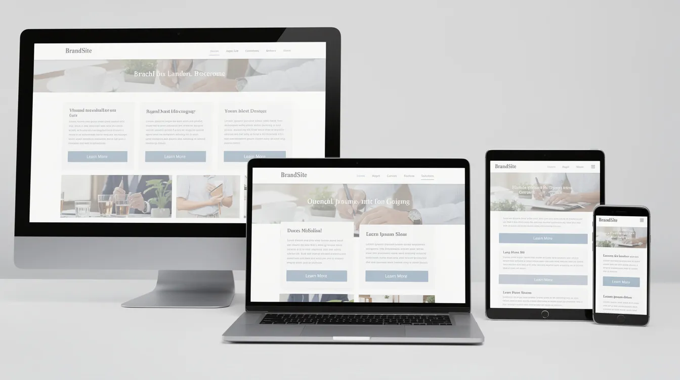
Flexbox lets items in a row or column automatically wrap, space out, and align depending on the available screen width. Think of a set of feature cards that sit three across on a wide desktop. As the browser window narrows below a certain breakpoint, Flexbox lets those cards wrap to a new row and eventually stack into a single column on mobile phones.
Conceptually, you're telling elements to "grow to fill available space" and "wrap to a new row when there isn't enough room." No JavaScript, no device detection-just CSS responding to screen real estate. EZPages.Pro uses Flexbox heavily for sections like header layouts, pricing cards, and call-to-action rows, keeping them clean and usable on smaller screens.
Using CSS Grid for Complex Responsive Pages
CSS Grid is the better tool for more complex responsive pages-magazine-style homepages, dashboards, or landing pages with distinct content zones. Grid lets web designers define template areas and fractional units so columns and rows reconfigure at different breakpoints.
For example, a landing page might display a hero section alongside a sidebar on desktop. On tablets and mobile phones, the sidebar shifts below the hero, focusing the user's attention on the primary message first. EZPages.Pro's team leverages CSS Grid through Duda's design system to keep these layouts robust and easily maintainable over time-critical when a client's site grows from five pages to fifty.
Media Queries: The Brains Behind the Breakpoints
Media queries are CSS rules that only apply when certain conditions are met-such as when the screen width drops below 768 pixels, or the device switches to landscape orientation. They're the mechanism that lets a responsive design adapts its look and feel without altering the underlying HTML. Media queries enable specific styles for different screen sizes, making them the control layer of any responsive site.
Breakpoints are the specific widths at which a layout "snaps" to a different configuration. Common breakpoints in modern web development fall around 480px (phones), 768px (tablets), and 1024px (small desktops and above). Best practices recommend using at least three breakpoints for responsive design, and choosing them based on when content visually breaks-not based on the latest iPhone or Galaxy model. EZPages.Pro selects breakpoints based on a client's actual content and layout based needs, ensuring the design feels deliberate on every device type.
At each breakpoint, media queries can adjust font sizes, padding, margin, column counts, navigation style, and even hide or reveal specific content blocks. You can add multiple media queries to handle increasingly granular adjustments. The key principle: apply media queries to adjust styles based on screen size, not to redesign the page from scratch at each width.
Mobile-First vs Desktop-First Media Queries
Mobile first design starts with a clean, simple layout for the smallest screens using base CSS. Then, min-width media queries progressively enhance the layout for larger screens-adding columns, expanding navigation, and introducing more complex design elements as screen real estate grows. This approach naturally prioritizes content visibility for mobile users first.
The older desktop-first approach works in reverse: build a complex desktop layout, then use max-width queries to strip it back for phones. This often results in a cramped, compromised mobile layout because the desktop design's assumptions don't translate well to smaller screens. EZPages.Pro follows a mobile-first responsive strategy, which aligns directly with Google's mobile-first indexing and how the majority of users actually browse in 2026.
Here's a simple example: a three-column feature section starts as a single stacked column on phones (the base CSS). At 768px, a min-width media query shifts it to two columns. At 1024px, another query expands it to three. The content is identical-only the layout based on viewport width changes.
Responsive Images, Video, and Other Media
Responsive images automatically resize within their containers to prevent overflow. On a desktop monitor, a hero image might stretch across 1400 pixels. On a phone, that same image scales down to fit 375 pixels without distortion, horizontal scrolling, or wasted bandwidth.
Large, unoptimized images are one of the most common causes of slow mobile loading. Serving a 3MB desktop image to a phone on a cellular network is painful for mobile users and destructive for performance metrics. Responsive image techniques solve this: the max width property set to 100% ensures images never exceed their container, while HTML attributes like srcset and sizes let the browser choose the right file size for the user's device resolution and browser width. The picture element enables art direction-serving a tightly cropped version of an image on phones versus a wider shot on desktops.
The same principles apply to video and embedded media. Players and aspect ratios need to adjust for narrow phone screens without letterboxing or overflow. EZPages.Pro optimizes all media as part of its managed hosting and performance tuning, so clients don't need to manually create image variants or worry about video embeds breaking on different devices.
Why Max-Width and Aspect Ratios Matter
Setting a max width of 100% with automatic height on images and video containers is the simplest way to prevent media from blowing out a responsive layout. A full-width hero image fills a large desktop but stays sharp and proportionally cropped on a 375px iPhone screen-no overflow, no horizontal scroll bar.
Defining aspect ratios or explicit dimensions in the markup also reduces Cumulative Layout Shift (CLS), one of Google's Core Web Vitals. When the browser knows the height and width of an element before it loads, the page doesn't "jump" as content renders. This matters for both user experience and SEO.
Responsive Typography and Readability
Responsive typography means adjusting font size, line height, and spacing so text remains legible whether someone reads on a 5.5-inch phone or a 32-inch monitor. Responsive designs should maintain readability across all devices-this isn't just a design preference, it's a usability requirement.
Fluid typography uses viewport width units and CSS functions like clamp() to scale text smoothly between a minimum and maximum size. Instead of hard-coding 16px body text that's fine on desktop but cramped on a watch-sized screen, you let the font size scale relative to the viewport width. Good responsive typography also controls line length (ideally 45–75 characters per line), contrast ratios, and paragraph spacing-all of which influence how long users stay on a page and how credible your brand appears.
EZPages.Pro bakes typographic scales and heading hierarchies into its templates. When a client adds a new blog post or service page, the text renders correctly across all breakpoints without manual tweaking.
Accessibility, Zoom, and User Preferences
Responsive text must coexist with accessibility needs. Users may zoom up to 200–400% or adjust system text-size preferences. Designs that lock font sizes or disable browser zoom violate WCAG accessibility guidelines and frustrate users with low vision. Accessible layouts help reach a wider audience by ensuring legibility across devices.
Beyond zoom, responsive layouts should respect user preferences like dark mode or reduced motion settings. EZPages.Pro targets WCAG-aligned typography and layout behavior, helping clients reduce legal risk (ADA and global accessibility regulations) while making their site usable for the broadest possible audience.
Key Components of a Responsive Layout
A truly responsive site isn't just about the grid and images. Every component-header, hero section, content cards, forms, CTAs, sidebars, footers, and complex elements like data tables or calendars-must adapt together. If the layout shifts correctly but the contact form is impossible to fill out on a phone, the site still fails.
For headers, the navigation bar disappears completely (in its desktop form) and becomes a compact hamburger or accordion menu on mobile. Hero sections swap from wide background images with overlaid text to simpler stacked arrangements. Content cards shift from multi-column grids to single-column stacks. Sidebars move below the main content. Tables become scrollable or transform into card-style layouts. Every element must consider tap targets, spacing, and content hierarchy at each browser window width.
EZPages.Pro builds reusable responsive components so clients can add new pages and content without breaking responsiveness, and integrates apps to extend website functionality like booking tools, chat, and accessibility widgets when needed. Whether it's a testimonials carousel or a pricing table, the module is designed once to work everywhere.
Responsive Navigation and Menus
Navigation typically evolves from a horizontal desktop menu-with visible dropdowns and multiple levels-to a hamburger button or "Menu" label on tablets and smaller screens. The goal: keep key pages one tap away while avoiding a cluttered user interface on smartphones. Ensuring navigation works smoothly on all screen sizes is one of the most important responsive design ux priorities.
Best practices include adequate tap areas (at least 48×48 pixels), clear labels, and logical link grouping. A B2B company with a multi-level services menu might convert it into an accordion on mobile, letting users expand only the category they need without scrolling past irrelevant links. EZPages.Pro configures navigation patterns that are both responsive and SEO-friendly-maintaining a clear URL structure and never hiding critical links from search engines.
Forms, Buttons, and Calls-to-Action on Mobile
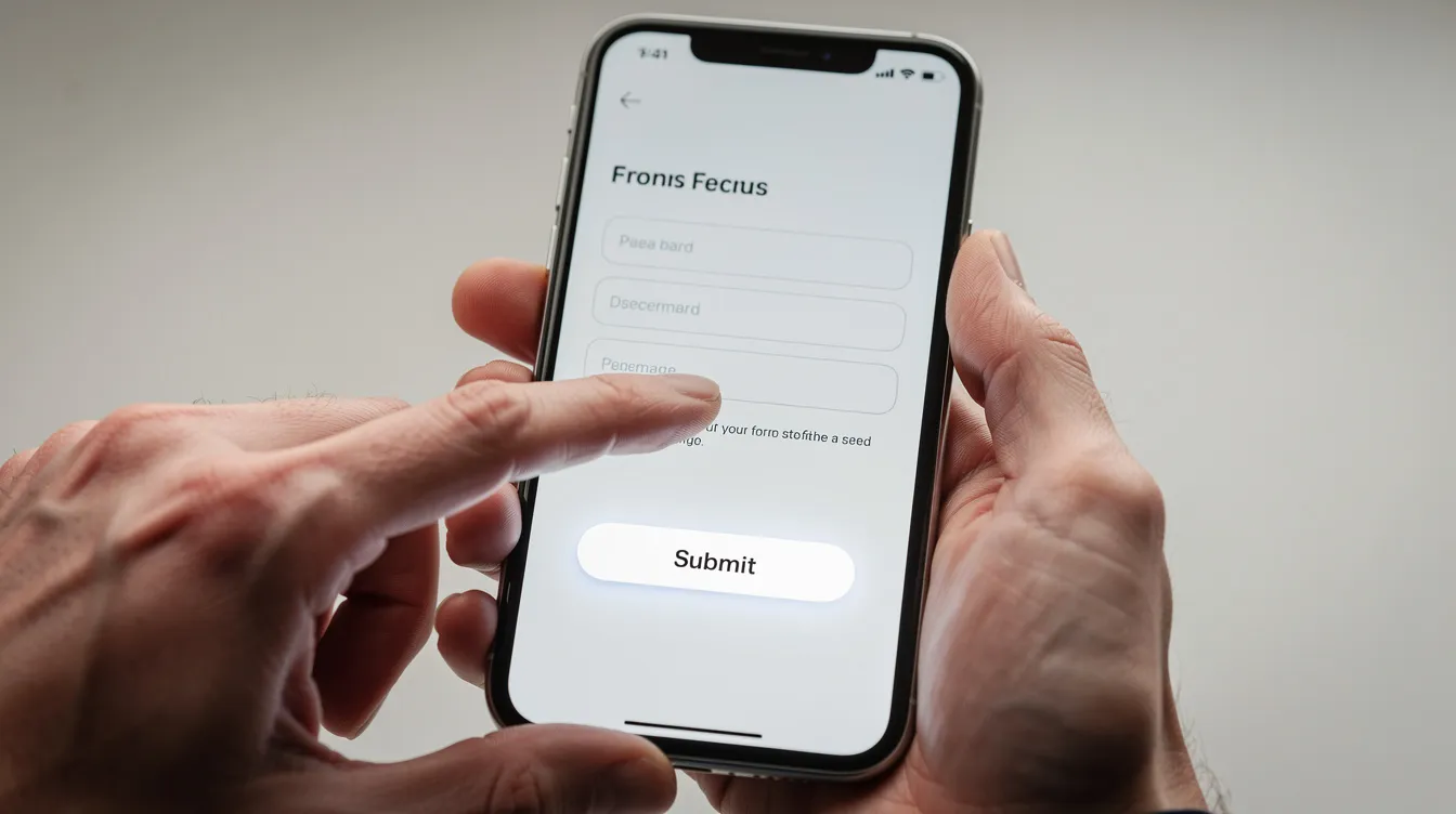
Interactive elements like forms, buttons, chat widgets, and booking tools need larger tap targets and simplified layouts on touch screens. Design for touch with large, easily clickable buttons-finger tips are far less precise than mouse cursors, and cramped form fields lead to frustrated users abandoning the page.
Effective mobile layout for forms means stacking fields vertically, reducing the number of required fields where possible, and placing primary CTAs in thumb-friendly zones (typically the lower half of the screen). EZPages.Pro sets up responsive contact, quote, and booking forms as part of every site build, testing them across common screen sizes to maximize completed submissions.
Responsive Web Design and SEO Performance
Responsive design and SEO are tightly connected. A responsive site uses one codebase, one URL per page, and consistent content across all devices-exactly what search engines want to see. Google has used mobile-first indexing since 2019 for ranking pages, and by mid-2024 this was fully rolled out for every website. If your mobile version has less content, fewer internal links, or missing structured data compared to the desktop version, your ranking potential drops.
Search engines prioritize mobile-friendly websites in search rankings. Responsive design improves SEO by enhancing mobile-friendliness across the board-readable text, accessible navigation, proper viewport configuration, and fast loading. It also supports Core Web Vitals (LCP, INP, CLS) by encouraging optimized images, modern CSS layouts, and fewer redirects between mobile and desktop URLs.
Responsive design improves SEO by enhancing user experience, too. When mobile users can actually read your content, tap your buttons, and navigate your pages without frustration, they stay longer and engage more. Those behavioral signals feed back into how search engines evaluate your site's quality.
EZPages.Pro includes on-page and technical SEO optimization with every build, ensuring responsive design and SEO work together from day one-not as an afterthought bolt-on, and can layer in essential SEO tools for small businesses to strengthen visibility further.
Responsive Web Design Examples (Real-World Patterns)
Rather than pointing to specific live URLs that might change, let's walk through three common archetypes that illustrate how responsive patterns solve concrete business problems. EZPages.Pro has clients across 14 countries using these same patterns to sell products, capture leads, and deliver information responsively.
Ecommerce and Product Catalogs
On a desktop, an ecommerce store might display a four-column product grid with always-visible sidebar filters and detailed hover interactions. On tablets, the grid drops to two or three columns, and filters collapse into a slide-out drawer. On mobile phones, products stack into a single column, filters become a modal, and a sticky "Add to Cart" button stays visible as users scroll.
Responsive images are critical here-product galleries are image-heavy, and serving desktop-sized photos to phone users kills performance. Serving appropriately sized image variants based on the user's device keeps pages fast. Small retailers have seen mobile checkout completion rates increase by 10–20% after simplifying their responsive layout and enlarging their mobile buttons. EZPages.Pro can integrate responsive ecommerce components and ensure they behave well on all devices.
Blogs, News, and Resource Hubs
Multi-column article archives and complex sidebars work well on wide desktop screens. On phones, those same elements need to collapse into a single-column feed for easy scrolling and reading. Responsive typography-larger body text, comfortable line height, scannable headings-directly improves dwell time and reduces bounce rate on content-heavy web pages.
EZPages.Pro structures blog archives, category pages, and article templates with responsive patterns that favor readability on mobile-because a blog that nobody reads on their phone isn't doing its job as a content marketing channel.
SaaS and Startup Landing Pages
A typical SaaS landing page includes a hero with a primary CTA, feature grids, pricing tables, testimonials, and FAQs. Each of these must adapt to narrow viewports. Comparison tables that show three plan columns side-by-side on desktop may reflow into stacked cards on smaller screens, keeping all information legible and scrollable.
EZPages.Pro specializes in fast, conversion-focused responsive launches for early-stage startups that need to look credible globally within weeks, acting as a top website builder for small businesses that handles design, hosting, and ongoing management. Responsive design ensures both sign-up conversions and investor-ready polish hold up on every device type a prospect might use.
Common Responsive Design Mistakes to Avoid
Even with the best intentions, web developers and web designers frequently stumble on these issues:
- Designing desktop-first and cramming it down to mobile. This almost always produces a cluttered mobile layout with unreadable text, overlapping elements, and navigation that feels like an afterthought.
- Unoptimized images. Serving 2MB images to a phone on a 3G connection inflates Largest Contentful Paint and drives users away. Optimizing images often delivers 30–50% improvements in LCP.
- Tiny tap targets. Buttons and links that are too small or too close together frustrate mobile users and increase bounce. Google Search Console flags these as mobile usability errors.
- Hidden or missing content on mobile. If your desktop version includes key structured data, internal links, or calls-to-action that the mobile version strips out, search engines index a weaker page.
- Testing only in one emulator. Test responsive designs on real devices for accuracy. Emulators miss touch behavior, real-world performance, and rendering quirks. Check layout adjustments at multiple breakpoints during testing-not just the most popular phone model.
- Accessibility oversights. Non-scalable text, low contrast, and hover-only interactions that don't translate to touchscreens hurt both usability testing outcomes and legal compliance.
EZPages.Pro's QA process and launch checklists are designed to catch these issues before a site goes live-especially critical for non-technical clients who can't debug CSS on their own.
How Responsive Web Design Fits into Modern Web Development
Responsive design isn't a standalone feature-it's woven into every layer of modern web development. Content strategy determines what users see on each device. Information architecture dictates navigation flow. Performance optimization ensures that responsive layouts actually load quickly on real networks. Security protects every responsive page from threats.
Responsive behavior must be considered at the component level-cards, banners, forms, navigation modules-and not bolted on after a desktop site is "done." CMS platforms and design systems play a key role here. Duda's infrastructure, which powers EZPages.Pro's sites, maintains a consistent responsive layout across dozens of pages because responsiveness is built into the template system, not layered on top.
For businesses, this means less technical debt, faster content updates, and confidence that new pages or sections won't break the mobile experience. It also means responsive web pages stay current as design trends evolve without requiring a ground-up rebuild every two years, especially when following small business web management best practices.
How EZPages.Pro Delivers High-Performance Responsive Websites
EZPages.Pro is a full-service B2B web agency building responsive websites for small businesses and startups across 14+ countries. Every site is designed mobile-first, built on proven responsive infrastructure, and delivered with hosting, security, compliance, and SEO optimization included.
Speed to market is a core differentiator. Most projects launch within 2–4 weeks-compared to the industry average of 8–12 weeks. Clients get a single point of contact for design, development, hosting, and ongoing management, benefiting from managed website services that reduce internal workload. No juggling separate vendors for hosting, SEO, compliance, and design updates.
Transparent, flat-rate pricing means you know exactly what you're paying for. Responsive design isn't an "add-on" or an upcharge-it's foundational to every EZPages.Pro plan.
Design, Build, and Launch: Our Responsive Workflow
The process follows a streamlined path: discovery and content mapping, wireframing with mobile-first layouts, visual design, implementation on Duda's platform, QA across devices, and launch. Throughout each phase, the team tests key breakpoints and common screen sizes to ensure the responsive layout feels deliberate on every device-not just "shrunk."
Built-in analytics setup (Google Analytics, Search Console) means clients can immediately see how users from different devices behave post-launch. Page templates and components are designed so non-technical clients can add new content while preserving responsive behavior, and the underlying flexible layout adapts automatically, especially when supported by a professional website management service.
Managed Hosting, Security, and Compliance for Responsive Sites
Responsive design needs fast, reliable hosting to perform-especially for global audiences on mobile networks. EZPages.Pro leverages Duda's infrastructure to deliver global CDN distribution, caching, and enterprise-grade security for every responsive site.
Built-in features include automatic backups, uptime monitoring, and ongoing updates that keep sites secure and performant. Privacy compliance (GDPR/CCPA) and accessibility (WCAG/ADA) are integrated from the start, reducing compliance headaches. These aren't add-ons-they're part of the managed service.
Ongoing SEO and Performance Optimization
EZPages.Pro focuses on SEO within the website itself: technical SEO, structured content, metadata, schema markup where appropriate, and Core Web Vitals–oriented improvements, backed by Duda platform built-in SEO tools and expert management. Periodic performance audits examine image sizes, script weight, and layout shifts across multiple devices.
Analytics data from mobile, tablet, and desktop categories informs iteration. If mobile conversion lags behind desktop, the team investigates-maybe a CTA needs repositioning, maybe a form needs simplifying. The goal: measurable improvements in rankings and conversion rates, tracked over time.
Is Your Website Truly Responsive? Quick Self-Assessment
Before investing in a redesign, check what you already have. Here's a quick self-assessment:
- Resize your browser window from full width down to about 375px. Does the layout reflow cleanly, or do elements overlap and text shrink?
- Open your site on your own phone and a tablet. Is text readable without zooming? Are buttons easy to tap? Does the navigation work?
- Use browser developer mode to simulate different screen sizes. Check for horizontal scroll, overlapping elements, and broken components at various widths.
- Check your analytics. Compare mobile bounce rate and time-on-page to desktop. A big gap often signals responsive problems.
- Run Google's mobile-friendly test. It flags viewport issues, small tap targets, and content wider than the screen.
If your site fails any of these checks, you're likely losing mobile visitors-and the search visibility that comes with a mobile optimized experience. Consider a responsive audit or redesign with a specialist like EZPages.Pro.
How EZPages.Pro Can Help You Go Fully Responsive
Many small businesses struggle with responsive web development for predictable reasons: limited in-house skills, fragmented vendors, and legacy themes or plugins that don't adapt to different screens. The result is a site that looks fine on one laptop but falls apart on everything else.
EZPages.Pro solves this with fast 2–4 week launches, transparent pricing, global experience across 14 countries, and fully managed websites that stay responsive as content grows. Every site is built mobile-first with optimized media, tested breakpoints, accessibility-minded layouts, and an SEO-ready structure.
This isn't a one-time handoff. EZPages.Pro is an ongoing partner-handling updates, new pages, security patches, and future responsive adjustments as new devices and screen sizes emerge, all governed by clear EZPages.Pro website policies and disclaimers. You focus on your business; we keep your digital presence performing on every screen.

Frequently Asked Questions About Responsive Web Design
These are the questions business owners and startup founders most commonly ask when considering a responsive redesign or new build. Answers focus on business impact, timelines, and practical next steps, and you can explore more guidance in the EZPages.Pro blog on digital strategy.
Do I need a brand-new website to become responsive, or can my existing site be fixed?
It depends on your current tech stack. If your site runs on a modern CMS with a reasonably flexible theme, it may be possible to add basic responsiveness through CSS updates and template adjustments. However, older sites built with fixed-width layouts, outdated plugins, or heavily customized themes are usually cheaper and more reliable to rebuild than to retrofit.
EZPages.Pro typically performs a quick audit first. If the structure is fundamentally inflexible, they recommend a fresh responsive build on their managed platform-avoiding the ongoing patchwork costs of trying to force responsiveness onto a foundation that wasn't designed for it. A rebuild also opens the door to improved UX, SEO, and compliance, benefits that usually outweigh band-aiding old templates.
How long does it take to launch a responsive website with EZPages.Pro?
Most projects go from kickoff to launch in 2–4 weeks, depending on content readiness and complexity. A typical breakdown: days 1–5 for discovery and wireframes, days 6–14 for design and build, and the remaining time for revisions, usability testing across devices, and final SEO checks.
Global clients collaborate asynchronously through email or video check-ins, making the timeline realistic even across time zones. The key variable is content-sites where copy, images, and brand assets are ready on day one move fastest.
Will responsive design change my content, or just how it appears?
Responsive website design mostly changes layout and presentation-stacking columns, resizing images, adjusting responsive typography-not the actual words or core content on your web pages. Your headings, body copy, metadata, and structured data should remain consistent across tablet and desktop versions and mobile for SEO and usability.
Some content decisions may differ by device. For example, a secondary decorative illustration might be hidden on mobile to reduce clutter, or a headline might use a shorter variant. But primary information, services, and CTAs stay prominent. EZPages.Pro works with clients to prioritize what matters most for each breakpoint so nothing critical gets buried on smaller screens.
How much does a responsive website cost, and what affects the price?
Cost varies based on the number of unique page layouts, required integrations (booking, chat, ecommerce), and custom design complexity. EZPages.Pro uses flat, transparent package pricing-no hidden fees or surprise charges for "making it responsive." Packages include design, development, hosting, security, and ongoing management.
Many EZPages.Pro clients pay significantly less than traditional agencies that charge $15,000+ for comparable responsive sites. For an exact quote based on your needs, view current plans or reach out directly.
Can I still update my content easily if EZPages.Pro manages everything?
Yes. Clients can choose to rely fully on EZPages.Pro for content updates, or use the built-in, user-friendly editor to change text, images, and basic layout blocks themselves. The underlying templates and components maintain responsiveness automatically, so basic content edits won't break your mobile layout or create responsive web pages that look different from what was intended.
For larger structural changes-adding a new page type, reconfiguring navigation, or integrating a new widget-EZPages.Pro steps in to ensure responsive behavior, scalable vector graphics, and performance remain strong across all devices. You never have to worry about whether a content update will break something on a device you haven't tested.
Ready to Upgrade to a Truly Responsive Website?
A responsive, mobile-first website is now a non-negotiable asset for any business that wants to be found, trusted, and chosen online. With over 60% of web traffic on mobile devices, every unresponsive page is a missed opportunity-lost leads, lower rankings, and eroded credibility.
EZPages.Pro delivers fast (2–4 week), conversion-focused responsive websites backed by global experience across 14 countries, all-in-one hosting and management, and transparent pricing. Stop making do with a site that doesn't work on half your visitors' screens.
Your next customer is already browsing on their phone. Make sure your site is ready for them.

EzPages.Pro specializes in small business web management and web development for small businesses and startups. Our tailored solutions simplify content updates, track performance with analytics, and ensure smooth site operation. With our all-in-one management services, you can focus on growing your business while we handle the rest.
🚀 Let’s build something great together.
EZPages blog