True or False: A Mobile Friendly Site Automatically Rearranges Content for Screen Size and Improves Usability Across Devices
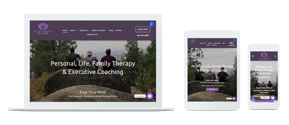
One Website. Every Device. Seamless Experience.
Welcome to your comprehensive guide on mobile-friendly, responsive web design. This page is crafted for business owners, webmasters, marketers, and anyone responsible for a website’s success. Here, you’ll discover what responsive design is, why it matters for usability and business growth, and how to ensure your website delivers a seamless experience across all devices—mobile, tablet, and desktop.
Mobile design encompasses various strategies for creating effective user interfaces on mobile devices, including responsive, adaptive, and separate mobile sites, as well as best practices for optimizing layouts and user experience.
A mobile friendly site automatically adapts its layout and content for any screen size, improving usability and accessibility across all devices. In today’s digital landscape, nearly half of all web activity happens on smartphones and tablets. If your website isn’t responsive, you risk losing customers, missing out on leads, and falling behind competitors. Mobile first design is a strategic approach that prioritizes designing for mobile devices before scaling up to larger screens, ensuring your site performs well for the growing number of mobile users. Web development plays a crucial role in bringing responsive and mobile-friendly sites to life by using techniques like CSS media queries and flexible layouts. Responsive design is essential for providing a positive user experience, boosting engagement, and driving business success in a mobile-first world.
A well-optimized mobile website demonstrates professionalism and builds trust with users.


Ready for More Customers? Transform Your Website for Mobile, Tablet & Desktop
Is your current website turning away mobile users? In today’s world, nearly 50% of digital activity happens on smartphones and tablets—if your site isn’t responsive, you’re missing potential business. EZPagesPro builds mobile-friendly, tablet-ready, and desktop-optimized websites that look stunning and work flawlessly everywhere your customers are, offering a top website builder for small businesses who need a professional online presence.
Our responsive websites do more than just “fit the screen.” We design dynamic, future-proof sites that evolve with technology—so your online presence stays ahead of digital trends. Mobile optimization leads to a positive user experience, better user engagement, and increased mobile traffic by ensuring your site loads quickly and is easy to navigate on any device. To assess and improve your site's mobile usability, we recommend using Google's Mobile-Friendly Test, a quick and reliable tool to identify and address mobile-specific issues. Whether your audience visits from a laptop, the latest iPhone, or an older device, they’ll enjoy a smooth, visually captivating experience.
Mobile-friendly websites are essential for business success, opening doors to a larger customer base and fostering customer loyalty and repeat purchases, especially for small businesses that need a website to compete and grow online. Testing on actual devices is essential to ensure a smooth user experience on mobile.
Why choose EZPagesPro?
- Custom Solutions: Every website is crafted for your brand, not a one-size-fits-all template.
- Device-Specific Features: Mobile visitors see click-to-call buttons and easy navigation, while desktop users enjoy richer visuals—your site adapts to every scenario.
- Easy Updates: Our platform makes it simple to manage your content, track analytics, and stay in control—no tech skills needed.
- Expert Support: Small businesses and startups get agency-level design and personal support at every step.
Experience Responsive Design That Adapts to You
When building websites with EZPagesPro, we focus on responsive and adaptive design—two main approaches to ensuring your site works seamlessly across all devices. Responsive design uses fluid layouts, flexible images, and media queries to automatically adjust content and features based on the device's screen size. In contrast, an adaptive site relies on fixed layouts that are specifically tailored for certain devices, such as mobile phones, tablets, or desktops, by detecting the user's device and serving the most appropriate pre-built layout.
For example, you can enhance your site with integrated apps that extend website functionality such as online booking, live chat, and membership tools:
- Instant Click-to-Call on Mobile
- Streamlined Forms on Tablets
- Full-Featured Layouts on Desktops
Testing your website on multiple devices—including smartphones, tablets, and desktops—ensures an optimal user experience and consistent performance across all platforms.
See for yourself—try our sites on your phone, tablet, and computer. Watch how images, buttons, and menus adapt instantly for effortless browsing, adjusting to each device's screen size.
Responsive design provides a seamless experience across all devices, while adaptive design may result in abrupt layout changes.
Your Website, Future-Proofed
The digital world never stands still—and neither do we. Our team constantly monitors web trends and updates your site to stay compatible with new devices, screen sizes, and browsers through managed website services that enhance your online presence. You’ll never need a costly redesign just to keep up.
Transparent Pricing, No Surprises
We believe in honest, upfront pricing—no hidden fees, ever.
100% Satisfaction Guarantee
If you’re not completely happy, we’ll make it right.
Get Started Today—Limited Openings This Month
Ready to boost your online presence and capture more leads? Book your free consultation now—our team has limited onboarding slots available this month, and you can contact EZPagesPro to discuss your project and goals in detail.
- Book Your Meeting
- Talk About Your Website
- Call us at [+1 310-421-0433](tel:(310) 421-0433)
- Email us at support@ezpages.pro
EZPagesPro—websites that grow with your business, today and tomorrow, backed by a comprehensive
website services disclaimer and policy framework that supports a secure, professional experience.

Is responsive web design the ultimate solution for adapting to the ever-changing mobile world?
In today’s digital age, having desktop-only sites just won’t cut it anymore. With nearly 50% of digital media time being spent on mobile devices, it’s clear that websites need to adapt to be mobile-friendly, tablet-friendly, and desktop-friendly. This is where EZPagesPro comes in, offering responsive web design that ensures your site looks great on any device and includes essential website features every business needs to succeed online. Whether your customers are accessing your website on a smartphone, tablet, or computer, they’ll have a seamless and visually appealing experience.
Unlike separate mobile sites or a dedicated mobile site—which involve creating a stand-alone website optimized specifically for mobile users—responsive design eliminates the need for separate mobile URLs. This simplifies content management, ensures consistency between the desktop version and mobile experience, and enhances link equity. While separate mobile sites and dedicated mobile sites can offer tailored user experiences and faster performance, they often require more maintenance and can present SEO challenges. Responsive web design, by contrast, adapts your content fluidly across all devices without the hassle of managing multiple versions.
However, it’s important to recognize that while responsive web design is a significant step forward, it is not the ultimate fix. The digital landscape is perpetually evolving, with new devices, platforms, and user expectations emerging regularly. At EZPagesPro, we understand that responsive design is an ongoing commitment, not a one-time solution. We continuously update and refine our design strategies to keep pace with technological advancements and ensure that your website not only looks great but also meets the ever-changing needs of your users. Additionally, with Google’s mobile-first indexing, the mobile version of your website is now the primary factor in determining your search rankings, making mobile optimization more critical than ever.
Your business deserves a responsive design that works for everyone, and that’s exactly what EZPagesPro is dedicated to delivering. Yet, we also remain vigilant, ready to adapt and innovate as new challenges arise in the mobile world, ensuring that your digital presence is as dynamic and resilient as the market itself. For clients who require even more tailored experiences, we also consider adaptive sites, which use fixed layouts for specific devices. Adaptive design can provide a more customized experience for certain devices but typically requires more development effort compared to responsive design.
How Responsive Web Design adapts to user behavior and environment based on screen size, platform, and orientation
Responsive Web Design (RWD) dynamically adjusts the appearance of a website according to the specific device being used by the viewer. Unlike adaptive design, which uses fixed layouts tailored for specific devices and switches between them based on device detection, responsive design utilizes a fluid layout that adapts smoothly to the device’s screen size. At the core of this approach is a fluid grid system, which forms the foundation of responsive web design by allowing layouts to scale proportionally and reflow content for any screen size. This approach leverages flexible grids and percentage-based widths to ensure a seamless, scalable experience across mobile phones, tablets, and desktops. Here’s how it adapts seamlessly to different factors such as screen size, platform, and orientation:
Adapting to Screen Size
With flexible grids and layouts at its core, RWD allows content to reflow based on the screen size of the device. Whether you’re viewing a site on a tiny mobile screen or a large desktop monitor, the layout shifts to provide an optimal viewing experience. This means text is readable without zooming, and clickable elements are appropriately sized.
You can test a site's responsiveness by resizing the browser window on a desktop to see how the layout adapts to different screen sizes.
Adjusting to Platforms and Operating Systems
- RWD accounts for the variances across platforms and operating devices by using CSS media queries. These queries enable the website to apply different styles depending on the device’s characteristics. Responsive design ensures compatibility across different operating systems by leveraging CSS media queries to deliver appropriate layouts and styles for each device. For instance, a website might load lighter animations or fewer visual effects on a mobile device compared to a desktop, fostering faster load times and improved usability.
Orientation Changes
- When a user switches from portrait to landscape mode on their device, a responsive website automatically rearranges its elements to suit the new orientation. The layout change is fluid, ensuring that usability is maintained regardless of how the device is held.
- RWD also considers the broader settings on a user’s device, such an activated VPN or specific accessibility settings. This capability ensures that all users, regardless of their device’s settings, can access and navigate the site effectively.
By integrating these flexible and intelligent strategies, responsive web design ensures that a website is functional, accessible, and visually appealing across all devices and settings, eliminating the need to create multiple versions of a website for different devices. This dynamic adaptation significantly enhances user experience and engagement.
KEY DESIGN ADJUSTMENTS FOR SMALLER SCREENS
When browsing websites on smaller devices like smartphones or tablets, noticeable changes in the design are essential to enhance readability and usability. Responsive typography, which uses relative font sizes such as ems, rems, or viewport width (vw), ensures that text remains readable across different resolutions without requiring manual zooming. These modifications ensure that the site remains functional and aesthetically pleasing across different devices. Here are some common design changes you might observe:
Simplified Navigation
- Menus often consolidate into fewer options or transform into a dropdown format, commonly known as a "hamburger menu", to save space and maintain ease of use.
Responsive Layouts
- Websites adapt to various screen sizes by restructuring their layout. For example, a website might display content in multiple columns on a desktop but will stack these columns vertically on a smaller screen. This stacking helps in maintaining the flow of content and ensures that users do not miss any information.
- Flexible layouts and fluid grid systems allow content to adapt smoothly to different screen sizes, ensuring usability and readability across devices. A flexible grid layout and fluid grids use relative units like percentages to create proportional, adaptable designs that shift and resize elements as needed. Additionally, flexible images in responsive design are set to a maximum width of 100% within their containers, preventing overflow and maintaining layout integrity.
Adaptation of Visual Elements
- Visual elements such as images and logos are resized or repositioned based on the screen dimension.
- Images can be scaled down to fit the width of the device, preventing horizontal scrolling that can detract from user experience. Using modern image formats like WebP or AVIF can further improve performance and responsiveness, as these formats are optimized for faster loading and better quality across devices. Flexible images in responsive design are typically set to a maximum width of 100%, ensuring they scale properly within their containers and do not overflow or break the layout.
- Logos might simplify, moving to a more prominent position like the center top of the page, often just above the navigation, to maintain brand visibility.
Content Prioritization
- To prevent clutter on smaller screens, non-essential content such as sidebars or decorative images often disappears or is moved to other sections like the bottom of the page. This prioritization helps in focusing the user's attention on the most crucial information first.
Increased Font Size and Button Spacing
- Smaller screens require larger fonts to improve readability. Additionally, button sizes may increase, and the spacing between clickable elements is typically enhanced to accommodate touch interactions and prevent accidental taps.
- Responsive typography uses relative font sizes—such as ems, rems, and viewport width (vw)—to ensure text remains readable across different resolutions without requiring manual zooming. This approach adapts font sizes and line spacing dynamically, enhancing readability and accessibility on all devices.
Optimized White Space
- While larger screens might feature generous white space to create a visually appealing layout, on smaller screens, this space is often reduced. This optimization helps in maximizing the use of space for critical content without overwhelming the user.
Each of these changes contributes to a smoother, more engaging mobile experience. Responsive design not only adjusts how content looks but also improves how it functions across different devices, ensuring that all users have a positive interaction with your website, no matter their screen size.
Fully Responsive Website FAQs
Introduction to Responsive Web Design
Responsive design automatically adjusts the layout and content based on the size of the screen viewing the site, ensuring a good user experience regardless of device. Responsive design is achieved through a combination of fluid grids, flexible images, and CSS media queries that adjust a website's look based on the screen size.
- Responsive design: Automatically adjusts the layout and content based on the size of the screen viewing the site, ensuring a good user experience regardless of device.
- Fluid grids: Use relative units like percentages instead of fixed units like pixels, allowing the layout to scale smoothly across different screen sizes.
- Flexible images: Images that automatically resize within their containers to prevent overflow and maintain layout integrity on any device.
- CSS media queries: Essential for responsive design, these allow different styles to be applied based on the characteristics of the device viewport, such as width and height.
With more people than ever accessing the internet from mobile devices, having a responsive website is no longer optional—it’s essential. Responsive web design not only delivers a consistent and enjoyable user experience across all platforms, but it also helps your business stand out in search engine results. Search engines like Google reward sites that are optimized for mobile phones and tablets, making responsive web design a smart investment for any business looking to grow its online presence.
Technical Aspects of Responsive Design
At the heart of responsive design are several technical building blocks that work together to create seamless experiences across different devices. CSS media queries are a cornerstone of this approach, allowing developers to apply specific styles based on characteristics like screen width, device orientation, and resolution. This means your website can look and behave differently on a smartphone than it does on a desktop, all from a single codebase.
Key Definitions and Concepts:
- Responsive design automatically adjusts the layout and content based on the size of the screen viewing the site, ensuring a good user experience regardless of device.
- Fluid grids use relative units like percentages instead of fixed units like pixels, allowing the layout to scale smoothly across different screen sizes.
- Flexible images are images that automatically resize within their containers to prevent overflow and maintain layout integrity on any device.
- CSS media queries are essential for responsive design as they allow different styles to be applied based on the characteristics of the device viewport, such as width and height.
How Responsive Design Works:
- Fluid grids: These use relative units (like percentages) to create layouts that scale proportionally to the screen size, ensuring content remains organized and readable on any device.
- Flexible images: Images are set to automatically resize within their containers, preventing them from overflowing or breaking the layout on smaller screens.
- CSS media queries: These are essential for responsive design as they allow different styles to be applied based on the characteristics of the device viewport, such as width and height. For example, a media query can specify that a navigation menu collapses into a hamburger icon on screens smaller than 768px wide.
By mastering these technical aspects—media queries, flexible grids, and flexible images—web designers can deliver responsive sites that look polished and perform flawlessly across all devices and browsers.
Search Engine Rankings and Performance
Responsive web design is a game-changer when it comes to search engine rankings and overall website performance. With Google’s mobile-first indexing, the mobile version of your website is now the primary factor in determining your search ranking. This means that having a responsive website isn’t just about aesthetics—it’s crucial for being discovered by new customers and benefits from SEO services that use built-in Duda tools for high rankings.
A responsive website ensures that your content is accessible and engaging for mobile users, which leads to improved user experience, longer site visits, and higher conversion rates. Responsive design also helps you avoid duplicate content issues, since all users and search engines access the same URL regardless of device. This consolidation of link equity and content makes it easier for your site to climb the search engine rankings, driving more organic traffic to your business. In today’s competitive digital landscape, a mobile friendly, responsive website is essential for maximizing your visibility and performance online.
Best Practices for Responsive Web Design
Creating an effective responsive website starts with a mobile first design approach—designing for smaller screens before scaling up to larger ones. This ensures that your most important content and features are front and center for mobile users, who make up a significant portion of web traffic, and lays the groundwork to transform clicks into customers with strategic web design. Use these best practices:
- Use relative units like percentages or ems, rather than fixed widths, to allow your design elements to scale smoothly across different devices and screen sizes.
- Optimize images by serving appropriately sized images for each device to dramatically improve site speed and user experience.
- Simplify navigation for mobile users.
- Make interactive elements touch-friendly.
- Test your website on a variety of devices and browsers to catch any issues before your customers do.
Responsive design is often preferred for new projects due to its flexibility and ease of use.
By following these best practices, you’ll create a responsive website that delivers a seamless, engaging experience for every visitor, no matter how they access your site.
Common Mistakes to Avoid in Responsive Design
Even with the best intentions, it’s easy to make mistakes in responsive web design that can undermine your site’s effectiveness. One of the most common errors is failing to test your website on different devices and browsers, which can lead to unexpected layout problems and a poor user experience. Another frequent mistake is relying on fixed widths instead of relative units, causing your design to break or look awkward on smaller screens.
Neglecting to optimize images for various screen sizes can also slow down your site and frustrate users, especially those on mobile devices with limited bandwidth. These issues not only hurt your user experience but can also negatively impact your search engine rankings. By prioritizing thorough testing, using relative units, and optimizing all design elements for flexibility, you can avoid these pitfalls and ensure your responsive website delivers the best possible experience for every visitor.
Mobile Optimization: Enhancing Performance and User Experience on Mobile Devices
Mobile optimization is no longer optional—it’s a necessity for any business looking to capture today’s web traffic. With the majority of users now browsing on mobile devices, a mobile friendly site is essential for reaching your audience and staying competitive in search engine rankings. Responsive web design is the foundation of effective mobile optimization, using flexible grids, flexible images, and CSS media queries to ensure your website layout adapts seamlessly across devices and screen sizes.
A mobile optimized website not only improves usability for mobile users but also supports improved search engine rankings, thanks to Google’s mobile first indexing. This means that your site’s mobile version is the primary factor in how it appears in search results. By prioritizing mobile optimization in your web design, you create a positive user experience that keeps visitors engaged and encourages them to take action—whether that’s making a purchase, booking an appointment, or contacting your business.
Responsive web design ensures that your content, images, and interactive elements look great and function smoothly on any device, from smartphones to tablets to desktops. By focusing on mobile optimization, you’ll see increased engagement, lower bounce rates, and better performance across devices—all of which contribute to your business’s online growth.
Touch-Friendly Interactions
For mobile users, touch-friendly interactions are key to a smooth and enjoyable browsing experience. On mobile devices, users rely on taps and swipes rather than clicks, so it’s crucial to design interactive elements that are easy to use with fingers and thumbs. Large, easily tappable buttons and links reduce frustration and make navigation effortless, while forms and input fields should be optimized for quick, error-free entry.
Enhancing user experience goes beyond just button size—consider spacing between interactive elements to prevent accidental taps, and use clear visual cues to indicate which elements are clickable. By making your site’s navigation, forms, and calls to action touch-friendly, you ensure that mobile users can interact with your website confidently and efficiently. Additionally, integrating device features like click-to-call or tap-to-email can streamline user actions and drive higher engagement.
Leveraging Device Capabilities
Modern mobile devices offer a range of built-in capabilities that can be harnessed to create richer, more personalized user experiences. By leveraging features such as geolocation, accelerometer, and gyroscope, your website can deliver interactive and context-aware content that delights users and sets your business apart.
For example, a local business can use geolocation to display nearby store locations or offer location-based promotions, while a fitness app might use the accelerometer to track steps or activity levels. Games and interactive experiences can utilize the gyroscope for more immersive gameplay. To further enhance performance, adopting modern image formats like WebP or JPEG XR ensures that images load quickly and look sharp on all devices, reducing page load times and improving overall user experience.
By thoughtfully integrating these device capabilities, you can create a mobile friendly site that not only meets but exceeds user expectations, driving engagement and loyalty.
Mobile-Specific Features and Enhancements
Delivering an optimal user experience on mobile devices means going beyond simple resizing. Mobile-specific features and enhancements are designed to make navigation and content consumption effortless, no matter the device’s screen size.
Related Blog Articles


Ready to Takeoff?
We will collaborate with you to develop a fully responsive website, optimizing for conversions.